The design of your screenshots can greatly impact your download performance
In my previous article about keeping users from deleting your mobile app I mentioned the importance of your app’s first impression to your users. Studies have shown that making a strong first impression on your App Store listing page can increase downloads by 35%.When it comes to the app store, nothing makes a bigger impact on shoppers than your screenshots.
Once a user hits your store page you have somewhere between 3 and 8 seconds to make a strong impression so that they will explore your listing and give you their attention. Because many users will only read the first sentence of your app description, if they read even that, your screenshots really have to do more than just show images from your app. Screenshots are the best way to communicate the purpose and major benefits of your app in a short amount of time. This means that the old method of just quickly taking 5 screenshots from your app and throwing them up on the store isn’t going to cut it.
Here are some tips to improve your App Store Screenshots and drive more downloads of your apps.
More than just pretty pictures
In many cases your App logo and screenshots are the first, and perhaps only, way you get to communicate with shoppers. Many users will skip right over your app description and take a look at your screenshots. That means that your screenshots, especially the first screenshot, need to highlight the main benefits of your app and tell the user why it is worth their time.
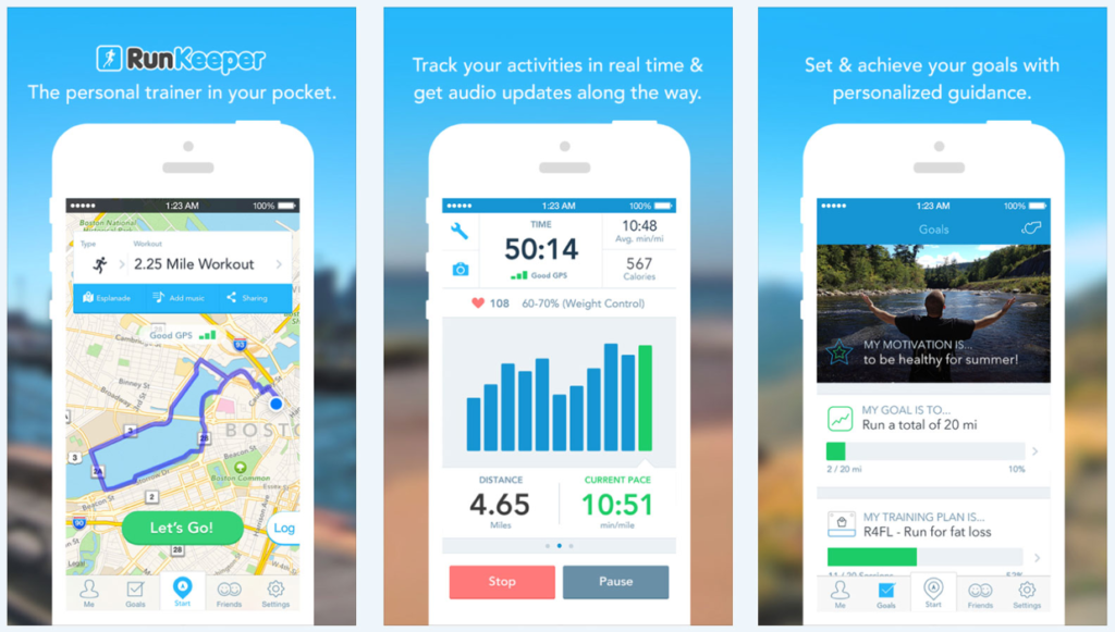
A great way to highlight these benefits is by inserting captions on your screenshots that quickly convey the main focus on the current screenshot. In the image below you can see how RunKeeper is able to very quickly show off the design of their app and convey it’s main benefit with just one screenshot.
Focus on Use Cases
What kind of text should we put in these screenshot captions? While designing your screenshots to highlight the features of your app is a good approach, research has shown that when captions instead communicate how the app is used, or how it can benefit the user, the app will get more downloads.
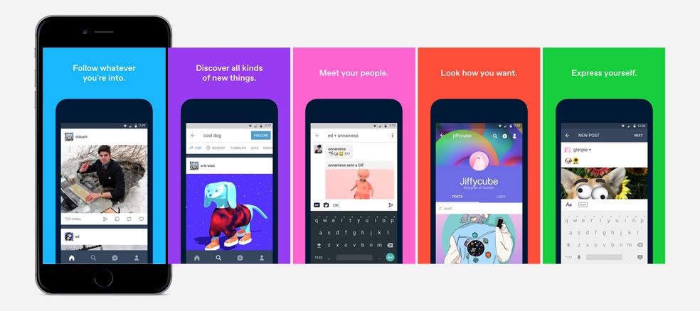
An example of this can be seen in the image below from Tumblr’s App Store listing. Each screenshot tells the user how they can keep up to date on their interests, discover new things, or meet new people. You want your screenshots to tell the user a story about how your app will benefit them.
Frame it right
Based on survey data of app rankings it appears apps that place their screenshots in an image of a phone tend to rank higher.
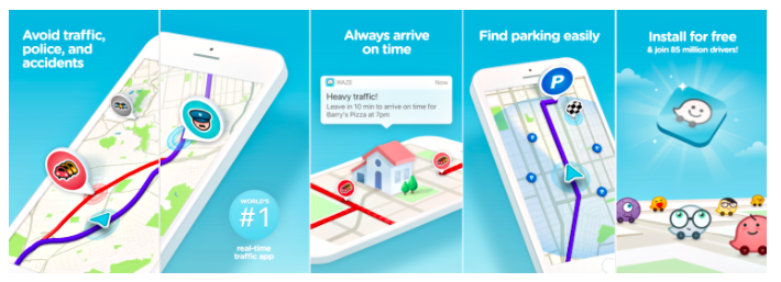
There are many variations of this this 'device frame' method. The Tumblr screenshots above use a simple gallery strategy that uses solid colored backgrounds to set off the phone and caption text. Other apps sometime use more detailed background photos that correlate to the content of the app, you can see an example of this in the RunKeeper screenshots. The connected gallery is for the graphic artists among us. This gallery treats each individual screenshot as one part of a larger continuous image. This can be done in a way that it entices the user to scroll to the next screenshot because they can tell that the image they are looking at isn't complete. You can see an example of this in the Waze screenshots from the next section.
If you spend some time browsing the top app lists you will definitely see this approach to screenshots as many of the largest publishers have found that framing screenshots on a phone can increase downloads.
Intelligent Design
We already know that the first screenshot is instrumental in creating a good first impression with your, hopefully, future user. Beyond just the first screenshot we need to organize all the images in a way that tells a story and steps the user through the decision process we want them to make. This process should sell the user on the benefits of the app and then end with a ‘call to action’ that instructs the user to download the app.
A great example of this can be seen in the screenshot gallery from Waze. These screens communicate the benefits of using Waze, work together to tell a story, and then end with a strong call to action telling the user to download.
Keep them updated
One of the most important things to remember is to keep updating your screenshots along with your app. When you release an update you should change your screenshots to show off your new features. App Updates are also a good time to try a new screenshot design to see if it affects your downloads. Make it your practice that every time you update your app, you are also making updates to your screenshot gallery.
Use this Free Template
To help you put these tips into practice I have created a free Photoshop template that makes it easy to put together great App Store screenshots. With this template you can drop in screenshots from your app, update the caption text, and be on your way to more downloads in the future.
You can download my free screenshot template by following this link. App Store Screenshot Template
Wrapping Up
There are so many different things that go into creating and distributing a successful app. By using these tips on how to improve your App Store Screenshots hopefully you will have one less thing to figure out. If you have questions, or you would like to talk more about your app development needs, schedule a strategy call with me by tapping the button below.